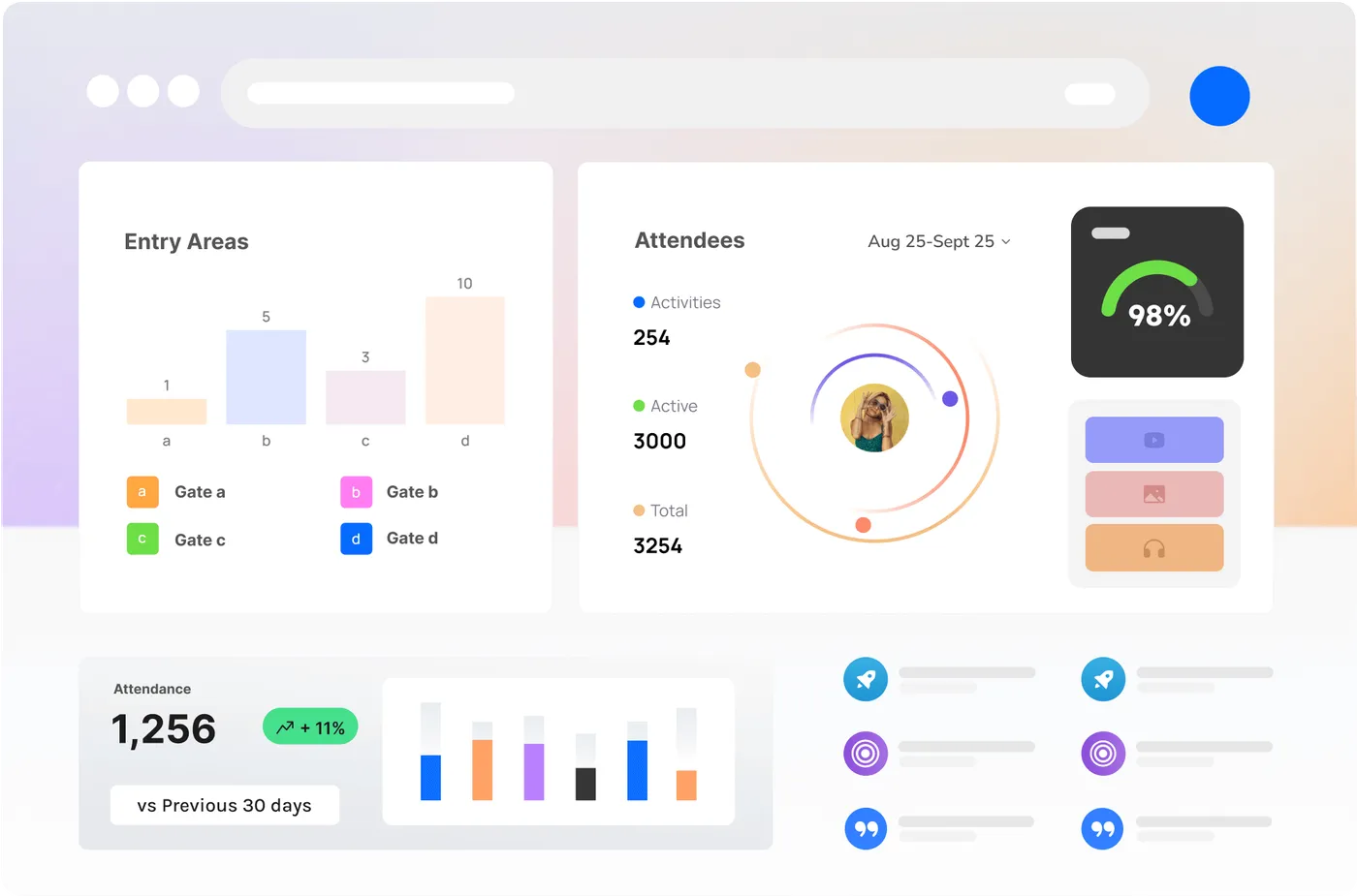
The fastest way to make data useless is to show all of it at once. On a calm afternoon, a wall of charts looks impressive. At 9pm with three queues building and a radio in each hand, an event manager needs one thing: the number that tells them what to do next. Designing for that moment — not for the demo — is what separates a dashboard people rely on from one they ignore.
Decisions first, metrics second
Good analytics design starts with the question, not the chart. What decisions does the control room actually make in real time — open a gate, move staff, hold entry? Each live view should map to one of those decisions and surface the metric that drives it, with everything else a click away. CrowdSense is built around this idea: clear, current numbers for the moment, deeper detail for the review.
Live clarity, deep analysis
There are really two audiences. The operations team in the moment needs glanceable, real-time status — green, amber, red — and immediate alerts when a threshold trips. The analyst after the event needs richness: trends, comparisons, exportable charts. A well-designed platform serves both without forcing either to wade through the other’s view.
Built to share
The best insight is worthless if it’s trapped in one screen. Reports that export cleanly into the formats stakeholders already use — for sponsors, councils and your own leadership — are what turn a night’s measurements into decisions that outlast the event. Design for the handoff, not just the screen.